Modern web performance is heavily influenced by how images are delivered.
If you’ve ever wondered:
“Why is the browser downloading a 2048px image on a 390px screen?”
—you’re not alone.
This question comes up constantly when working with responsive images, especially in galleries. And the answer isn’t a single bug or misconfiguration, it’s the result of how modern browsers interpret a combination of:
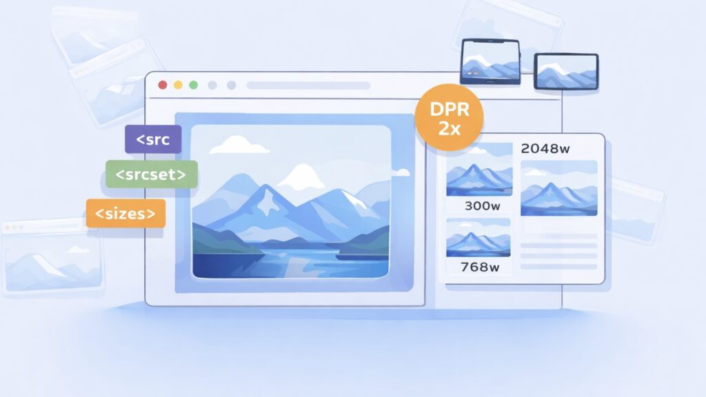
- src
- srcset
- sizes
- device pixel ratio (DPR)
- layout calculations
- and browser-specific heuristics
Yet, even experienced developers often misunderstand how src, srcset, and device pixel ratio (DPR) work together.
Let’s unpack what’s really happening.
The Three Core Pieces: src, srcset, and sizes
At a glance, a responsive image looks like this:
<img
  src="image-1024.jpg"
  srcset="
    image-300.jpg 300w,
    image-768.jpg 768w,
    image-1024.jpg 1024w,
    image-2048.jpg 2048w"
  sizes="(max-width: 600px) 100vw, 50vw"
  alt=""
/>
Each attribute has a distinct role:
🧩 src — the fallback
The src attribute is the default image URL:
src="image-1024.jpg"- Always required
- Used by older browsers
- Acts as a fallback if srcset fails
👉 Best practice: Use a medium-sized, optimized image — not the original.
🗂️ srcset — the smart selector
The srcset provides multiple candidates, and the browser chooses the best one.
srcset="
    image-300.jpg 300w,
    image-768.jpg 768w,
    image-2048.jpg 2048w"
📏 The Missing Piece: sizes
Without sizes, the browser assumes:
“This image will be displayed at 100% of viewport width (100vw).”
That’s often wrong.
sizes="(max-width: 600px) 100vw, 50vw"This tells the browser:
- On small screens → full width
- Otherwise → half width
This is critical because the browser does not wait for layout to finish. It must decide early which image to download.
📱 Device Pixel Ratio (DPR): The Hidden Multiplier
DPR defines how many physical pixels are used per CSS pixel. Modern devices have high-density screens.
- Standard display → DPR = 1
- Retina → DPR = 2
- Some devices → DPR = 3+
The browser calculates: required image width = CSS display width × DPR.
⚙️ How Browsers Actually Choose an Image
The selection algorithm is:
1. Determine display width
From sizes (or fallback to 100vw)
2. Multiply by DPR
Device Pixel Ratio (DPR):
- Standard screen → 1
- Retina → 2
- High-end → 3
Example:
- Layout width: 300px
- DPR: 2
👉 Required image width = 600px
3. Pick best match from srcset
Browser chooses:
- Closest image ≥ required width
- Or next largest available
⚠️ Real-World Problem: Overfetching
Let’s say you have:
srcset="300w, 768w, 2048w"And your layout needs:
- 660px (due to DPR)
Expected: 👉 768w
But in reality, some browsers (especially Safari) may choose: 👉 2048w
🧪 Why Browsers Load Bigger Images Than Expected
1. Inaccurate sizes
If sizes doesn’t match real layout:
- browser loses confidence
- picks larger image “just in case”
2. Complex calculations
sizes="calc((330px - 145px) / 0.56061)"👉 Problem:
- Hard to evaluate precisely
- Especially in dynamic layouts (React, sliders)
Result: 👉 browsers (notably Safari) may ignore it
3. Sparse srcset
Bad:
300w, 768w, 2048wGap between 768 → 2048 is huge.
👉 If 768 is slightly too small → browser jumps to 2048
4. Safari’s “safety-first” behavior
Unlike Chrome:
- Chrome → tries to optimize bandwidth
- Safari → prefers visual quality
👉 Safari often overfetches to avoid blur
🖼️ The Hidden Role of src
Even with srcset, src still matters:
- Used as fallback
- Sometimes used initially before srcset resolves
- Can trigger unnecessary downloads if misused
👉 Never use original high resolution image in src.
🚨 Common Mistakes
❌ Using original images everywhere
Leads to:
- huge downloads
- slow pages
- poor SEO
❌ Missing sizes
Browser assumes 100vw → downloads large images
❌ Overly complex sizes
Leads to incorrect selection (especially in Safari)
❌ Large gaps in srcset
Forces browser to pick oversized images
🔬 Real-World Insight from Gallery Development
While working on advanced gallery systems (like Re Gallery), we consistently observe:
👉 Most performance issues are not from JavaScript 👉 They come from incorrect image selection strategies
Typical problems:
- 200–900 KB images loaded for thumbnails
- Multiple unnecessary downloads
- Mobile users downloading desktop-sized assets
🚀 The “Smart Strategy” for Galleries
A modern gallery should:
✔️ Use responsive srcset
✔️ Match sizes to layout (not theory)
✔️ Limit max resolution for grids
✔️ Load high-res only when needed (lightbox/zoom)
✔️ Avoid runtime mutation of image attributes
🧠 Key Takeaway
Responsive images are not just about adding srcset.
They are about aligning three things perfectly:
- Layout (sizes)
- Available assets (srcset)
- Device capabilities (DPR)
If any of these are off:
👉 browsers will compensate
👉 and usually overfetch
💬 Final Thoughts
Responsive images are one of the most powerful — and misunderstood — parts of modern web performance.
Get them right, and you:
- dramatically improve load times
- reduce bandwidth usage
- deliver sharper visuals where it actually matters
Get them wrong, and the browser will quietly download megabytes your users never needed.
If you’re working with large image collections or building custom solutions, it’s worth investing time into getting this right — the impact is immediate and measurable.